Jak změnit velikost vyskakovacího okna Mega Menu
Everything You Need To Create Your Free Website
Pomocí našeho nástroje Website Builder můžete navrhovat a vytvářet webové stránky bez kódování. Přetáhněte vše, co chcete, na jakékoli místo, kde to chcete. Tvůrce webových stránek automaticky přizpůsobí váš web pro mobilní zařízení tak, aby reagoval. Vybírejte z více než 9 000 přizpůsobitelných šablon webových stránek.
Related Features
How To Resize The Mega Menu Popup On A Website
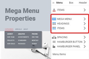
When getting started working with Mega Menus, you must attend to many menu styling and sizing aspects. So after getting started, it is important to make your custom style of the mobile menu and site menu as user-friendly as possible. And our flexible menu settings will help you with this task. The popup flyout menus can be pleasant surprise mechanics or irritating gimmicks that distract users from navigating top-level menu items. To customize the size of the popup menu, you need only to click on the menu itself, and when the blue frame appears, stretch the menu width and height as much as you need.
If you simply max-width or height of your popup mega menus, this may not improve how it will be presented, whether the mobile menu or top-level menu item to click on. Using theme options under Mega Menu width and height, you can quickly change the level menu item positions, size, style, and text of the menu item on the top. Whether a website-oriented or mobile menu, you must form your custom appearance menus to attract users. Make sure the level items and related articles have some space after custom menu settings so visitors would see and differ from them.
Under Mega Menu, menu item text will play a crucial role in attracting attention and helping in navigation on the top level. Remember that bigger does not always mean better, especially in the case of mobile menu settings. If you want to use our theme integration for your website, you will have theme options that will help to re-size and customize tabbed mega menus. It is better not to skip to content if you have already applied mega menus with various level items because the user will decide what content he wants.


