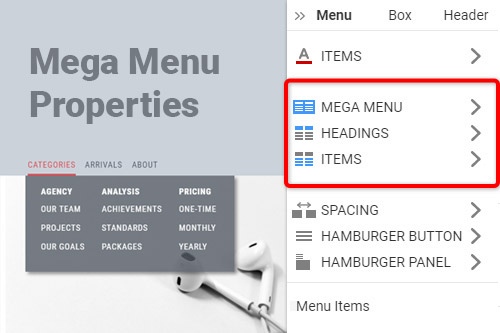
Jak upravit vlastnosti Mega Menu

Everything You Need To Create Your Free Website
Pomocí našeho nástroje Website Builder můžete navrhovat a vytvářet webové stránky bez kódování. Přetáhněte vše, co chcete, na jakékoli místo, kde to chcete. Tvůrce webových stránek automaticky přizpůsobí váš web pro mobilní zařízení tak, aby reagoval. Vybírejte z více než 9 000 přizpůsobitelných šablon webových stránek.
Related Features
How To Customize The Mega Menu Properties In the Property Panel
When you start building your main menu and menu bar, you want to make it as unique as possible. Your main menu is a welcoming element that becomes a guide for your visitors, so making your menu screen reader accessible is the first and foremost important task. It is also important to make the screen reader accessible mega navigation menu to attract even more potential users. After creating the content for your mega navigation menu, use the responsive menu properties our builder provides to customize the menu itself, headings, and menu item options.
Customizing the menu itself is very easy and allows you to customize the menu bar and, for example, accordion menu style in a matter of minutes and set it more mobile menu oriented. Make a custom content menu using content images and text fonts with a corresponding background color and menu bar size that will fit the standard website menu and mobile menu simultaneously. You can customize and set the main parent menu item looks in the headings group and put them the way you see fit. In the items group, you will be able to customize any item within the menu.
You can set up the menu item link for every item in the menu and set the displaying the way it would be easier for the screen reader to analyze the menu's content. Even the accordion menu is a great example showing that the menu text content that correlates with background color and proper spacing between every item is the key point in creating a beautiful and functional web design. You must imagine and test how the navigation with your menu feels and adjust it with the menu properties to provide a great user experience.

