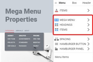
Jak přesunout položky nabídky Mega
Everything You Need To Create Your Free Website
Pomocí našeho nástroje Website Builder můžete navrhovat a vytvářet webové stránky bez kódování. Přetáhněte vše, co chcete, na jakékoli místo, kde to chcete. Tvůrce webových stránek automaticky přizpůsobí váš web pro mobilní zařízení tak, aby reagoval. Vybírejte z více než 9 000 přizpůsobitelných šablon webových stránek.
Related Features
How To Move Mega Menu Items In The Popup
Moving the top Mega Menu items is very comfortable changing the Menu design. With Nicepage, you can easily move items within the Mega (or Sticky) Menu. Whether you use the Hamburger or text mobile menu, this feature will help you anyway. Please note that items of the different menus (max menu or even the sticky menu) have different sizes. Like the modern max menu widget and WordPress menu builder, it enables working with the Mega Menus new items, such as adding new items, moving them, etc. If the Max Menu doesn't display all the items optimally on mobile, you can change and move items. To move the navigation menu or the Top Level items easily, you do not need to search for a new feature, and everything is here. Besides, you must consider the Top menu item background color, border radius, font style, font size, etc. For example, to display blurry content through the max menu toggle blocks, you must select a translucent background color for the navigation bar background.
If you've been using the Menu Widget, you can replace this tool with this feature to adjust the menu of your target page, the home page, or whatever page you want. Add different types of information to the mobile menu bar (max menu) to attract customers' attention and improve their shopping experience. As a rule, mega menus may only be created for items on the top-level menu and not for submenu items. You can even move the main menu mobile toggle blocks without the Menu classic menu builder. Mega menus today are a wonderful design choice for the level items. So, with the new feature general settings, you can move the main menu for every item. It was beneficial that users could reach the top-level items and toggle blocks, though that particular menu behavior is slightly unexpected. You can make with the new feature. Mega Menus Mobile Toggle bar is very popular in web design. If you don't know how to move the mega menus mobile toggle bar without page builder, the answer will find here. Tabbed mega menus are also very popular in modern web development.
You can decide to display a minimized Mega Menus hamburger icon or the completely vertical accordion menus menu with the animation effect. Use this feature if you cannot modify items within the menu widget or even change the background color. By setting your mobile menu to the full width, you could make the mobile bar display in a reduced width when you close it. You can set the full width for the mobile menu bar, change the general settings, and show only the necessary elements. If you don't want to use the menu widget for moving the max mega items, visit Nicepage. In some cases, there is a need to open a new tab for the main menu item, and you can make it with this feature (similar to the WordPress page builder and Menu builder). When you have added a new menu item, you will see that it has its set of options in the new menu on the right-hand side. Max Menu transforms your existing menu or menu automatically into a menu. The feature allows to place the second level menu in one line/and mix them within Mega Menus.


