

dgmsteel
posted this
14 October 2018

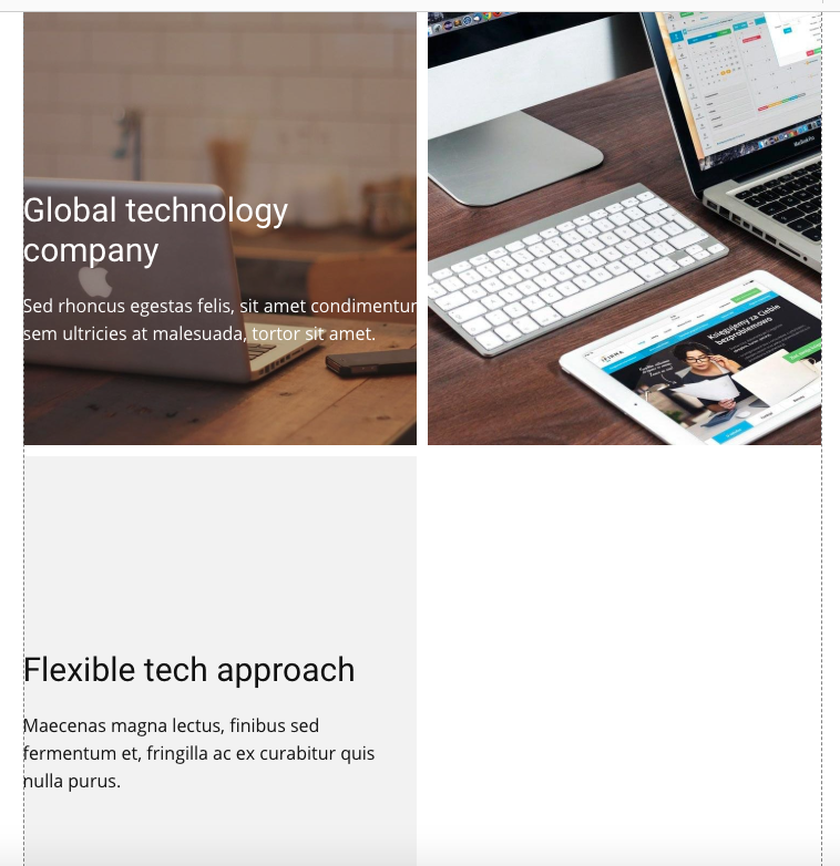
As you can see from the screenshot when you have a section with 3 (columns) in Tablet portrait mode it displays 2 columns with the third column underneath to the left leaving a blank space to the right which does not look nice. Is it possible to make the 3 columns 100% wide so that they display underneath each other as in Phone mode?
Last edited 15 October 2018 by Support Team
Vote to pay developers attention to this features or issue.
