Support Team
posted this
09 July 2019
Hi Jeff,
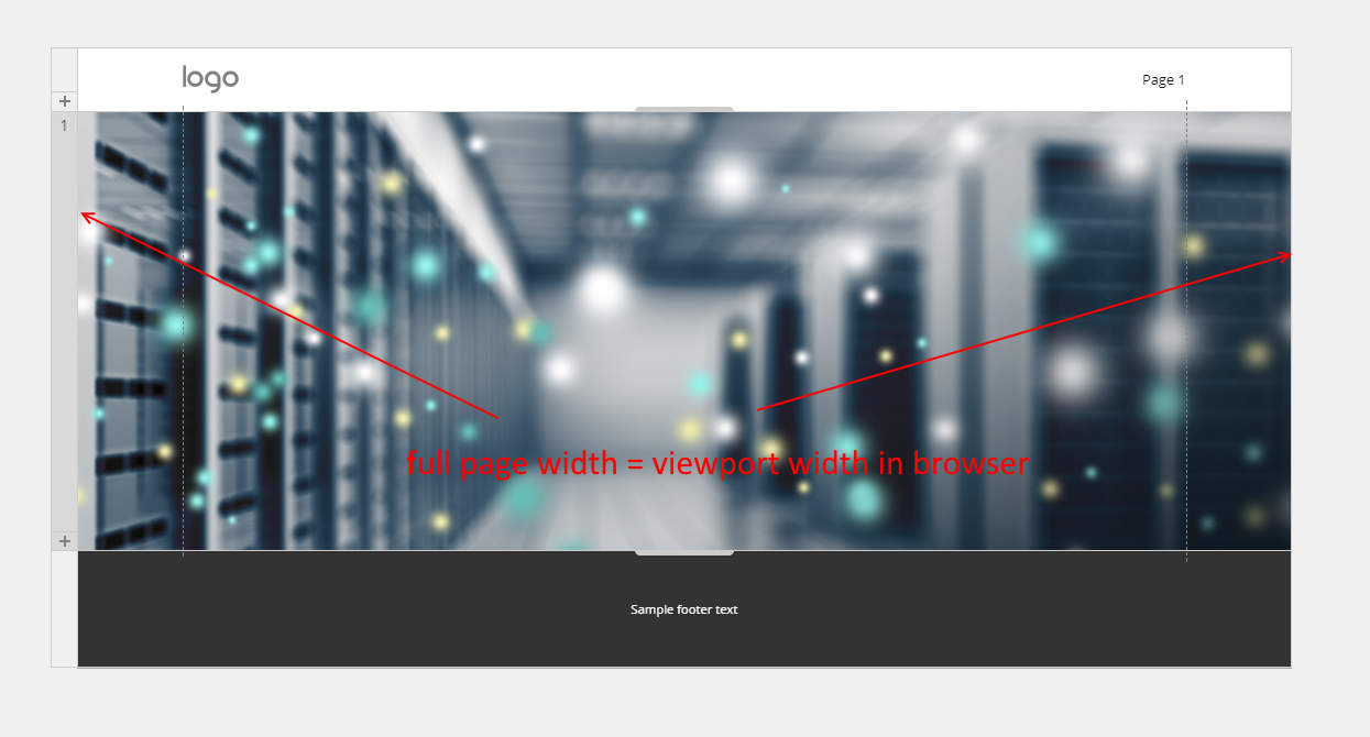
add an image that is to be the background image and that this image will retain its aspect ratio in each mode, ie deskstop/phone/tablet/laptop.
Background image always retains its aspect ratio. But you can choose between "Cover" and "Contain" fit options. The difference is that when "cover" is used, the image covers the whole container (width and height). But since it retains proportions, some parts of the image go outside the visible Section borders. "Contain" option means that the image will fit the Section width only. In this case, you will see the empty space around the image because Section size and image size cannot be equal. The background image is a style of the container (Section), not the independent HTML element. All styles follow the basic CSS rules, including the Section background image.
When you switch between responsive modes, the Section width changes. The Section height may be changed too. This affects the image size (width and height) also, but not its aspect ratio.
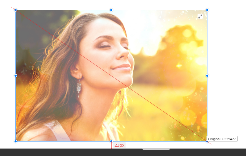
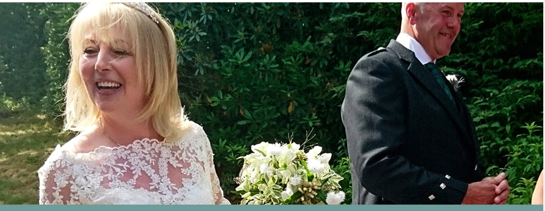
So, if you want to see the whole image, you should either use "Contain" fit or do not use this image as a background image. Use it as Picture control and resize it with the diagonal marker, as shown above.
...................................................
Sincerely,
Olivia
Nicepage Support Team
Please subscribe to our YouTube channel: http://youtube.com/nicepage?sub_confirmation=1
Follow us on Facebook: http://facebook.com/nicepageapp
Hi Jeff,
> add an image that is to be the background image and that this image will retain its aspect ratio in each mode, ie deskstop/phone/tablet/laptop.
Background image always retains its aspect ratio. But you can choose between "Cover" and "Contain" fit options. The difference is that when "cover" is used, the image covers the whole container (width and height). But since it retains proportions, some parts of the image go outside the visible Section borders. "Contain" option means that the image will fit the Section width only. In this case, you will see the empty space around the image because Section size and image size cannot be equal. The background image is a style of the container (Section), not the independent HTML element. All styles follow the basic CSS rules, including the Section background image.
When you switch between responsive modes, the Section width changes. The Section height may be changed too. This affects the image size (width and height) also, but not its aspect ratio.
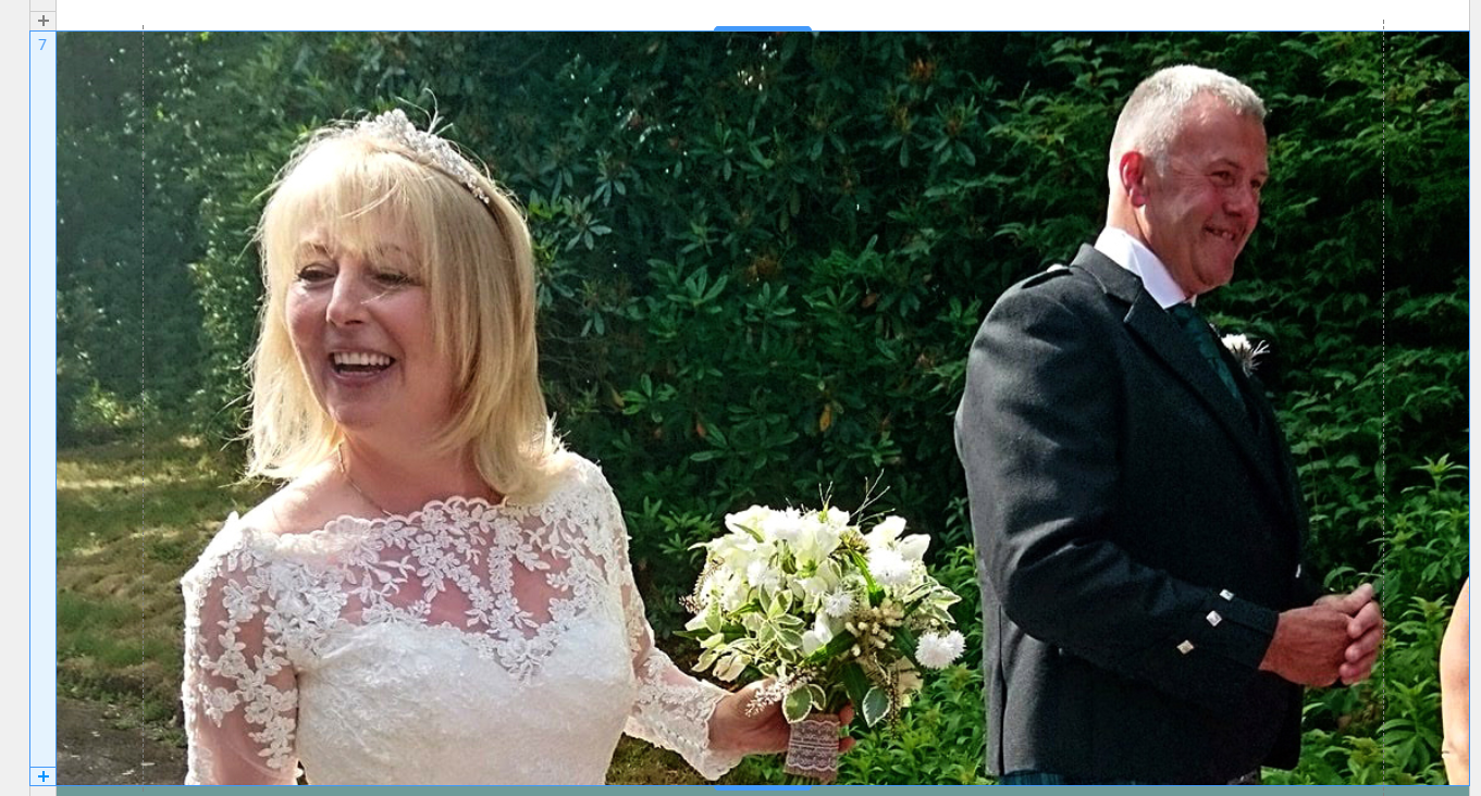
So, if you want to see the whole image, you should either use "Contain" fit or do not use this image as a background image. Use it as Picture control and resize it with the diagonal marker, as shown above.
...................................................
Sincerely,
Olivia
Nicepage Support Team
Please subscribe to our YouTube channel: http://youtube.com/nicepage?sub_confirmation=1
Follow us on Facebook: http://facebook.com/nicepageapp


