

gkobler
posted this
18 March 2019

Hello
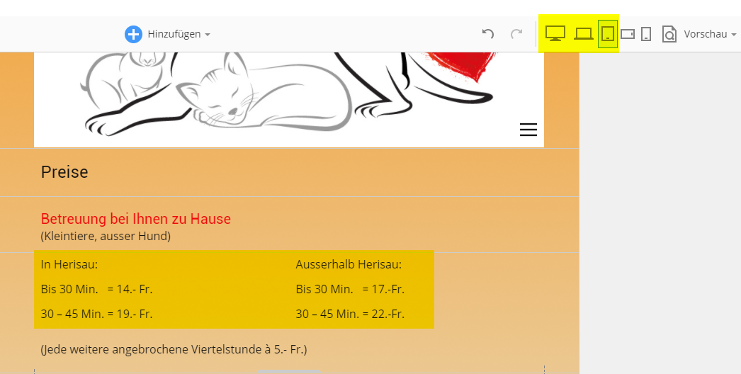
I have a section with a grid of two collumns and three rows.
On the responsive view Desktop, Notebook and Tablet the view are good! (See "Aufnahme18.png"
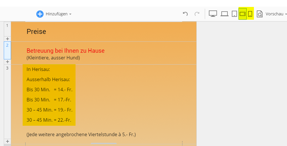
But on Phone Landscape and Portrait the gridcell are made a cell break!
So the interpretation of the content of the cell are completly wrong! (see "Aufnahme19.png"
The content of the cells are small, so the cell break wouln'd be nessesary! How can i prevent the cell break in the phone view?
Best Regards and thanks for a hint.
Gregor
Vote to pay developers attention to this features or issue.

