Como usar o elemento Full-Width Slider no web design
Tudo que você precisa para criar seu site gratuito
Use nosso Construtor de Sites para projetar e criar sites sem codificação. Arraste e solte o que quiser, para qualquer lugar que quiser. O Criador de sites adapta automaticamente seu site para dispositivos móveis para torná-lo responsivo. Escolha entre mais de 9.000 modelos de sites personalizáveis.
Recursos Relacionados
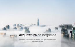
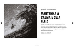
Modelos grátis com Elemento deslizante
Comece com nossos melhores modelos, ótimos para qualquer negócio. Crie e personalize-os com nosso poderoso e gratuito construtor de sites sem código. Todos os modelos são compatíveis com dispositivos móveis e têm uma aparência excelente em qualquer dispositivo.


How To Create Your Free Full Width Slider Site
How to create a website, a WordPress theme or a new custom site template with your own best full width slider examples that will reflect the dynamics and your unique approach to your customers and visitors? First, you must discover how to add a full-width responsive element to build a layout with the free full-width online plugin. Quickly creating your full width slider is easy if you use our program and our site provides free download so that you can start at any moment.
After downloading, start the new site and click on the element tab, where you will find the fullwidth slider. Our best free web builder can set up your full width slider or image slider using the most relevant plugins. This builder with a full width slider using an image slider module provides multiple settings for slider design after you pick it. Set up the full width slider, and make sure to look through the settings in the right panel to customize the font size and style of the text and fit your fullwidth slider design into the overall website design. Other elements like skip to content and terms of service will be automatically placed above no matter what slide is currently on the screen. The fullwidth slider will support any resolution, whether on the phone or the latest monitor.
It is a good idea to pick several similar slides to promote the main theme with an image slider of your sites like real estate, food & restaurants, or sports. You can make a full width slider the distinguishing feature of your future websites if you discover how to add custom high-resolution images and unique fonts, which you can save as presets in your library. Tutorials with image slider module presented on our site will help you to realize the full potential of the full width slider element, as well as many others.