Summary
- Overview
- Enable Animation On Hover
- Test Animation On Hover
- Hover Animation Effects
- Copy And Paste Animation On Hover
- Animation Properties
- Animation Duration
Overview
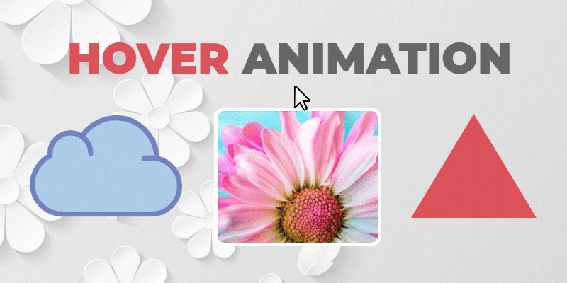
Use Animation On Hover to add interaction to your web designs. You can apply Hover Effects to the Elements like Texts, Images, Icons, Shapes, etc., and Containers, including the Box Element, Grid, and Grid Repeater Items.
Enable Animation On Hover
You can add the Hover Effect for an Element in the Property Panel.
Test Animation On Hover
To test Hover Animation Effects, click the Play button near the Hover checkbox in the Property Panel.
Hover Animation Effects
You can do the following to apply the Animation On Hover, for example, to change the Background Color for the Shape Element.
- Add the Shape Element.
- Go to the Property Panel to the right.
- Scroll down to the Animation section.
- Click on the Hover link.
- Click on the Fill Preset.
- Change the Color.
- Unselect the Shape Element by clicking beyond it.
- Test the Effect by hovering over the Shape.
Animation Presets
You can use the Presets to quickly add the Animation Effects On Hover, including Fill, Shadow, Radius, Border, Scale, Shift, and Shift Up.
The Presets do not accumulate the Properties but apply the specified ones, and you can see the Selected Preset in the Property Panel.
Color Change on Hover
You can change the Background Color On Hover for the Shape, Icon Elements, and Box.
Background Change On Hover
You can also switch the Background On Hover from the solid Fill to an Image Background, for example, or Gradient for the Box Elements or Grid Repeater Items.
Shadow Change on Hover
The Shadow can also be altered on Hover.
Radius Change on Hover
For Images and Shapes, you can modify the Radius on Hover.
Border Change on Hover
You can also change the Border On Hover for Elements and Containers.
Transparency Change on Hover
You can also add interaction with Transparency on Hover.
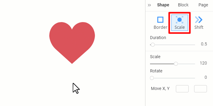
Element Scale On Hover
Scale Elements on Hover by inflating or shrinking. The actual size is equal to 100. The supported values are from 10 to 200. However, you can enter a number over 200 if needed.
Element Rotate On Hover
Rotate an Element on Hover by dragging the slider or entering the angle value in the Rotate section of the Property Panel. The supported values are from 0 to 359.
Element Move on Hover
You can also move an Element on Hover by setting the X and Y values in the Move section of the Property Panel. The values can be positive and negative, reflected in the movement direction.
Copy And Paste Animation On Hover
Copy and paste the Animation On Hover with the Style applied to an Element or Container.
Animation Properties
You can set the properties for Animation On Hover depending on the Element, including the Duration, Background, Border, Shadow, Shape, Radius, Transparency, Scale, Rotate and Move.
Animation Duration
Use the Duration for the Animation on Hover Effects.
Publish or preview to test the actual Duration effect.
![hover-effect-duration.gif]()
## Summary
- Overview
- Enable Animation On Hover
- Test Animation On Hover
- Hover Animation Effects
- Animation Presets
- Copy And Paste Animation On Hover
- Animation Properties
- Animation Duration
## Overview
Use **Animation On Hover** to add interaction to your web designs. You can apply Hover Effects to the Elements like Texts, Images, Icons, Shapes, etc., and Containers, including the Box Element, Grid, and Grid Repeater Items.
!animation-on-hover.gif!
## Enable Animation On Hover
You can add the Hover Effect for an Element in the Property Panel.
!enable-animation-on-hover.png!
## Test Animation On Hover
To test Hover Animation Effects, click the Play button near the Hover checkbox in the Property Panel.
!preview-animation-on-hover.png!
## Hover Animation Effects
You can do the following to apply the Animation On Hover, for example, to change the Background Color for the Shape Element.
1. Add the **Shape Element**.
2. Go to the **Property Panel** to the right.
3. Scroll down to the **Animation** section.
4. Click on the **Hover** link.
5. Click on the **Fill** Preset.
6. Change the **Color**.
7. Unselect the Shape Element by clicking beyond it.
8. Test the Effect by hovering over the Shape.
##
!animation-hover-apply.png!
### Animation Presets
You can use the Presets to quickly add the Animation Effects On Hover, including **Fill, Shadow, Radius, Border, Scale, Shift**, and **Shift Up**.
The Presets do not accumulate the Properties but apply the specified ones, and you can see the Selected Preset in the Property Panel.
!hover-animation-presets-improved.png!
### Color Change on Hover
You can change the Background Color On Hover for the Shape, Icon Elements, and Box.
!animation-hover-color.gif!
### Background Change On Hover
You can also switch the Background On Hover from the solid Fill to an Image Background, for example, or Gradient for the Box Elements or Grid Repeater Items.
!animation-hover-bg-type.gif!
### Shadow Change on Hover
The Shadow can also be altered on Hover.
!animation-hover-shadow.gif!
### Radius Change on Hover
For Images and Shapes, you can modify the Radius on Hover.
!animation-hover-radius.gif!
### Border Change on Hover
You can also change the Border On Hover for Elements and Containers.
!animation-hover-border.gif!
### Transparency Change on Hover
You can also add interaction with Transparency on Hover.
!animation-hover-transparency.gif!
### Element Scale On Hover
Scale Elements on Hover by inflating or shrinking. The actual size is equal to 100. The supported values are from 10 to 200. However, you can enter a number over 200 if needed.
!animation-hover-scale.gif!
### Element Rotate On Hover
Rotate an Element on Hover by dragging the slider or entering the angle value in the Rotate section of the Property Panel. The supported values are from 0 to 359.
!animation-rotate-scale.gif!
### Element Move on Hover
You can also move an Element on Hover by setting the X and Y values in the Move section of the Property Panel. The values can be positive and negative, reflected in the movement direction.
!animation-rotate-move.gif!
## Copy And Paste Animation On Hover
Copy and paste the Animation On Hover with the Style applied to an Element or Container.
!animation-hover-copy-style.gif!
## Animation Properties
You can set the properties for Animation On Hover depending on the Element, including the **Duration, Background, Border, Shadow, Shape, Radius, Transparency, Scale, Rotate** and **Move**.
!animation-hover-properties.png!
## Animation Duration
Use the Duration for the Animation on Hover Effects.
!duration-animation-hover.png!
Publish or preview to test the actual Duration effect.
!hover-effect-duration.gif!
##