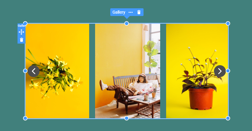
The Gallery Carousel Element is an excellent tool for presenting a collection of images, such as your portfolio works, brand logos, and much more. It works similarly to the Image Slider Element but simultaneously shows several images. You can customize the carousel with the properties, fine-tuning it to fit your needs and how it looks and interacts with users.
Add Gallery Carousel
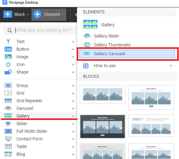
You can add the Gallery Carousel from the Carousel, Image Gallery, and Slider sections from the "Element" menu on the Top Bar.
Convert Images To Carousel
Add a new image to the Gallery Carousel by clicking the Plus icon on the Context Toolbar for the selected Image.
You can choose a Video instead of an Image.
Carousel properties
Like the Image Gallery, you can set various properties for the Carousel and its Arrows in the Property Panel.
Carousel Image Size
You can set the Carousel Image Size.
Fit Images
Additionally, you can change the Fit option for each Image, set Cover or Contain.
Preview in Mobile Views
You can edit and preview the Gallery Carousel in all available Mobile Views.
Read Also
The Gallery Carousel Element is an excellent tool for presenting a collection of images, such as your portfolio works, brand logos, and much more. It works similarly to the [Image Slider](page:97211) Element but simultaneously shows several images. You can customize the carousel with the properties, fine-tuning it to fit your needs and how it looks and interacts with users.
!image-carousel.png!
## Add Gallery Carousel
You can add the Gallery Carousel from the Carousel, Image Gallery, and Slider sections from the "Element" menu on the Top Bar.
!add-image-carousel.png!
## Convert Images To Carousel
Add a new image to the Gallery Carousel by clicking the Plus icon on the Context Toolbar for the selected Image.
!adding-image-carousel.gif!
You can choose a Video instead of an Image.
## Carousel properties
Like the [Image Gallery](page:98179), you can set various properties for the Carousel and its Arrows in the Property Panel.
!carousel-arrow-image-properties.png!
## Carousel Image Size
You can set the Carousel Image Size.
!carousel-image-size.gif!
## Fit Images
Additionally, you can change the Fit option for each Image, set Cover or Contain.
!carousel-image-fitting.png!
## Preview in Mobile Views
You can edit and preview the Gallery Carousel in all available Mobile Views.
!carousel-mobile-views.png!
## Read Also
- [Gallery](page:)
- Gallery Thumbnails
- [Gallery Slider](page:97211)
- [Slider](page:97200)
- Full Width Slider
##


